Legal & General checkout journey

Project overview
Legal & General is a British multinational financial services company headquartered in London, UK. They’ve helped over 10 million people globally with saving, investing, and building retirement income since 1836.
My first project was designing their ISA (Individual Savings Account) checkout journey while working on an agile team for their Personal Investing division.
🗓️ 2018–2019
Background
ISA’s are tax-efficient personal ‘wrapper’ which allow UK residents to save or invest up to £20,000 each year without paying tax on any personal interest or capital gains they may earn.
It’s a great product but dropout rates were around 20% for each step.
This meant lost potential revenue and could lead to a negative relationship between the brand and the customer if it wasn’t fixed.
The site wasn’t responsive, it was time to think of a mobile-first approach.
Below outlines my process and some of the UX deliverables I created. If you would like to learn more about this project, feel free to contact me.

User flow

There were two paths one could take when investing in this ISA:
We do it for you option (for the beginner investor) selecting a multi-index fund based on risk
Pick your own funds option (for the expert investor) to select in individual funds
Due to technical constraints by our third-party payment providers the payment screens had to live at the end of the journey for both paths.
Experience map (existing journey)
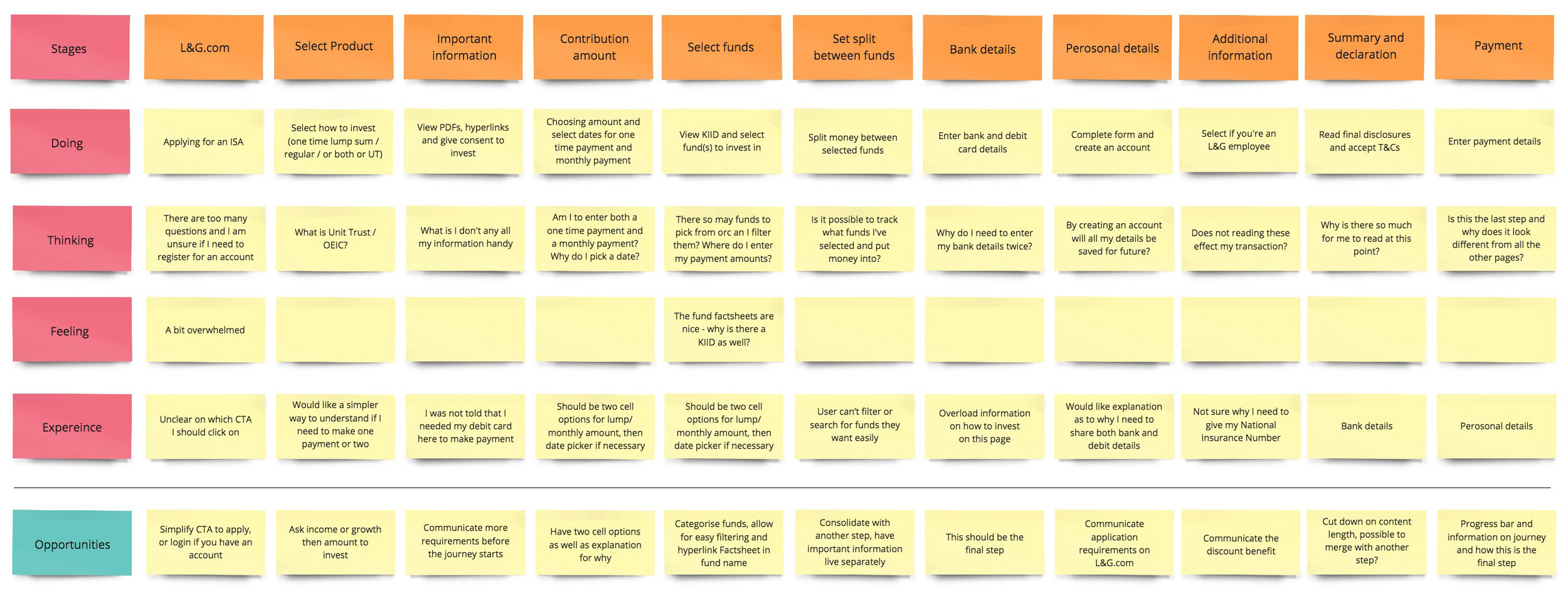
The existing checkout journey had many confusing points that needed to be addressed and analyzed to establish some opportunities for improvement. All pain points, actions, and happy points were compiled in a group exercise.
Wireframes


A congested 12-step journey was now condensed to 9 steps total.
We stripped down 2/3 of copy by compiling content and moving supporting information into tooltips. We also challenged our legal and compliance teams on necessary content to push how we we’re speaking to our audience.
Competitor research
To get a deeper understanding of what our competitors were offering and speaking to their audience, I analyzed their paths, sign-up journeys, and tone of voice to note mainly happy points and key differentiators.
My research included competitors and other tech companies who were doing a great job of attracting online users, like Revolut, Monzo, and HABITO.

Proto personas
By applying prior knowledge of our user types, their potential motivations, and problems/goals, I was able to hold an exercise where we created three new personas on which to base our testing.

Newbie or “Noob”
The beginner investor explores investment options, is new to financial risk, cares about brand recognition, and transparency of fees, looking to build knowledge.

Dabbler
The savvy investor, looking to diversify their portfolio, influenced by friends and family, performance history, cares about brand recognition and fee transparency.

Expert
The seasoned investor or broker. Monitors funds regularly and are not looking to play the market. Diversifies their portfolio, interested in performance history.
Experience map (new journey)
With a list of ideas from the competitor analysis, I was able to host another experience exercise reflective of the new user flow and address additional opportunities to add to our wireframes.

User testing
With a new mobile-first journey it was time to test how our user types felt about it.
We had 6 users complete an end-to-end journey usability test through a clickable mobile prototype. We had testers start on the product website to familiarize themselves with the ISA investment and then decide which path they would take (invest by risk or pick their own funds).
The testing was mediated and recorded in a private room, while a group of us captured live feedback, consolidating comments along the way.
Summary of results
We had moved all the Terms & Conditions to the start of the transactional journey and this tested fine.
Filters in the DIY journey were more useful for experts, with room for education for newbies.
Users needed clearer ways to understand and compare funds before making a decision.
The ‘basket’ concept when investing in funds in the DIY journey was clear with some minor issues.
The checkout journey tested very well but the success page was too copy-heavy.
Since this redesign in August 2018 there has been a 60% increase in completed applications.