Cisco Meraki App Marketplace
The Meraki Marketplace houses apps built by ecosystem partners. Existing partners can promote and manage their apps; and new users can explore apps, request demos, and apply to become a partner.

Problem
The existing marketplace design needed a refresh, it had a legacy filtering system and the was off-brand. The end-to-end experience needed to be re-evaluated.
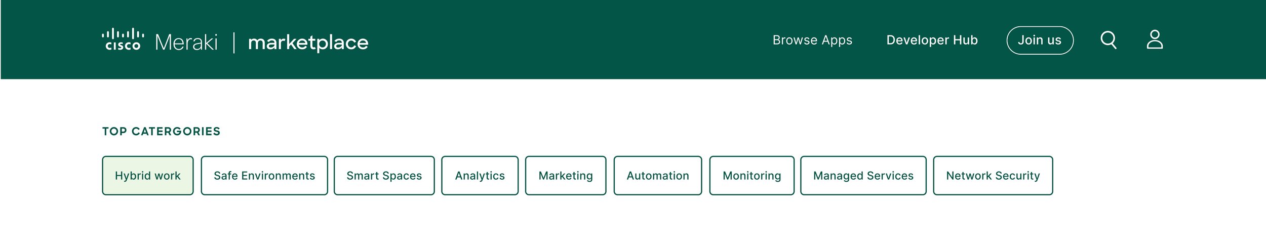
Solution: Update the navigation
Picking up an existing design, we had to question everything that was displayed on the site. We deconstructed each link and title before giving it a new location.

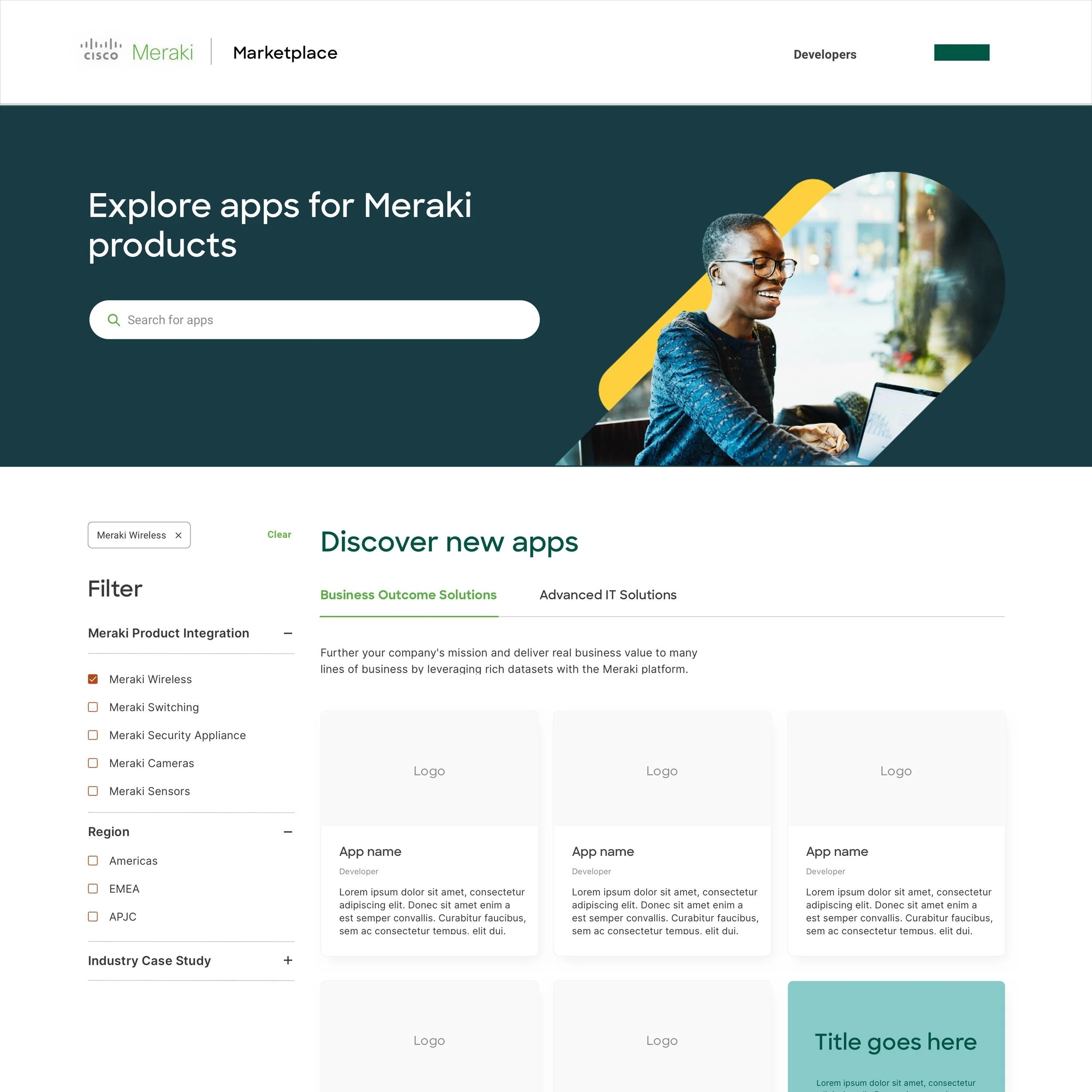
Legacy navigation

Updated design
Rethink the filtering system
We analyzed the performance, naming, and placement of each app category to improve discoverability. A tagged filtering system raised the bar.
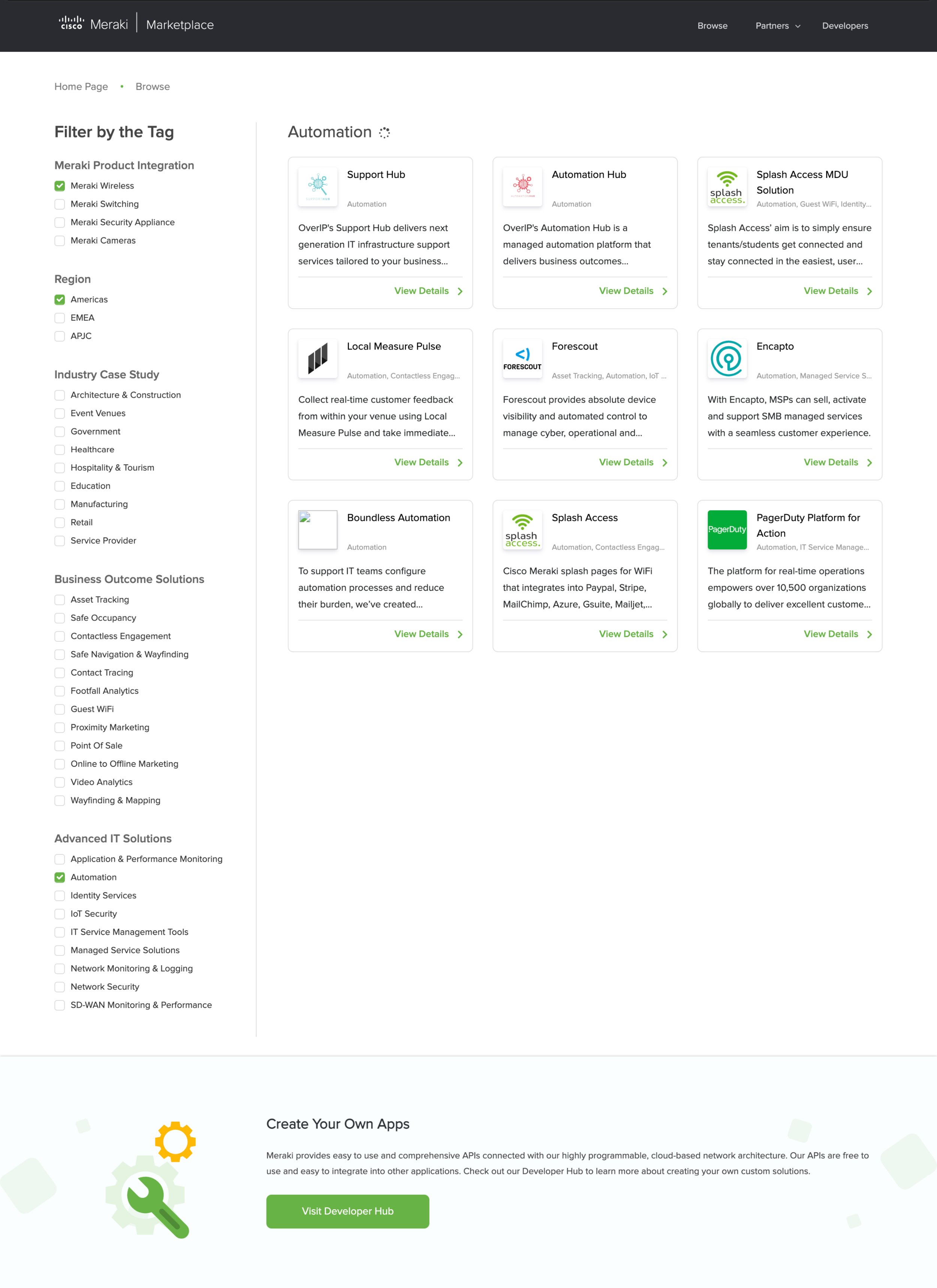
Legacy filtering system

Updated design
Redesign the forms
Our forms were elongated and burdensome. We had an opportunity to enhance our experience and decrease drop-off rates to increase the number of submissions.

Legacy partner application

Updated design
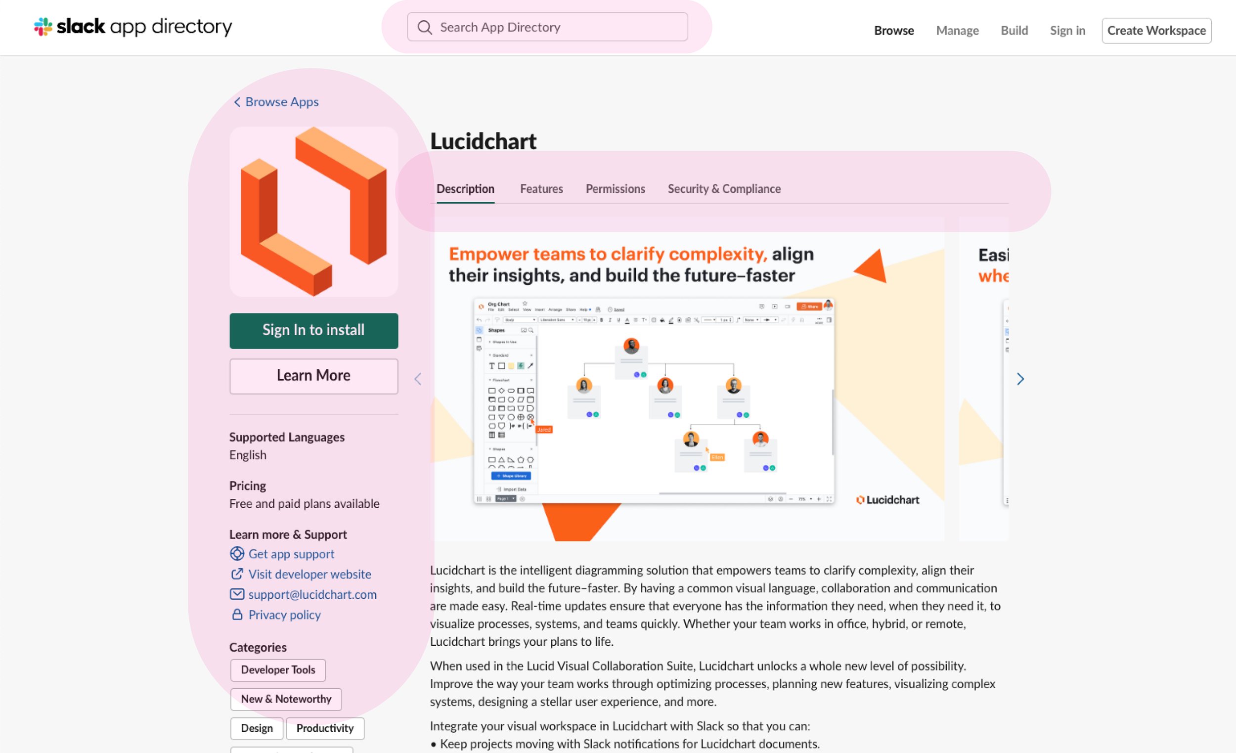
Enhance the app detail page
A tighter grid cleaned up the look and feel of the app detail page. We were able to establish a new template for all of our partners to display their app highlights.

Legacy app detail page

Updated design
To achieve this
We conducted interviews, analyzed engagement, completed competitor audits, and usability sessions to rapidly iterate on design decisions.
Interviews: Stakeholders
We had to learn about the context and history of this product, as well as learn the future vision so we could design a filtering system that would grow with the business. Dynamic filtering was a result of these conversations and tied into our marketing web strategy.
Interviews: Sales Engineers
When Meraki doesn’t have a solution for a customer – they turn to our apps. Understanding how our sales team guided customers through the site helped us understand their pain points like the demo request form, and what they liked.

Interviews: Product marketers
Speaking to those who marketed this product helped us understand what to highlight and promote to users. As a result, we integrated a platform demo link, feature banners, and customer story module to circulate users back to the marketing website.

Interviews: Ecosystem partners
To understand the pain points involved in applying and managing app detail pages, we interviewed both new and long-standing partners. These conversations guided our registration form, app detail, and login page redesign.

Interviews: Technical team
A third-party agency hosted our marketplace. We needed to understand the constraints and limitations to know how far we could push the design. We also had to confirm our ways of working as their dev team was based overseas.
Problem: Homepage drop-off rates were high
Upon arrival, users could not see any apps. They were asked to select a primary category, then a subcategory before viewing any apps. This left users questioning if they were in the right place.


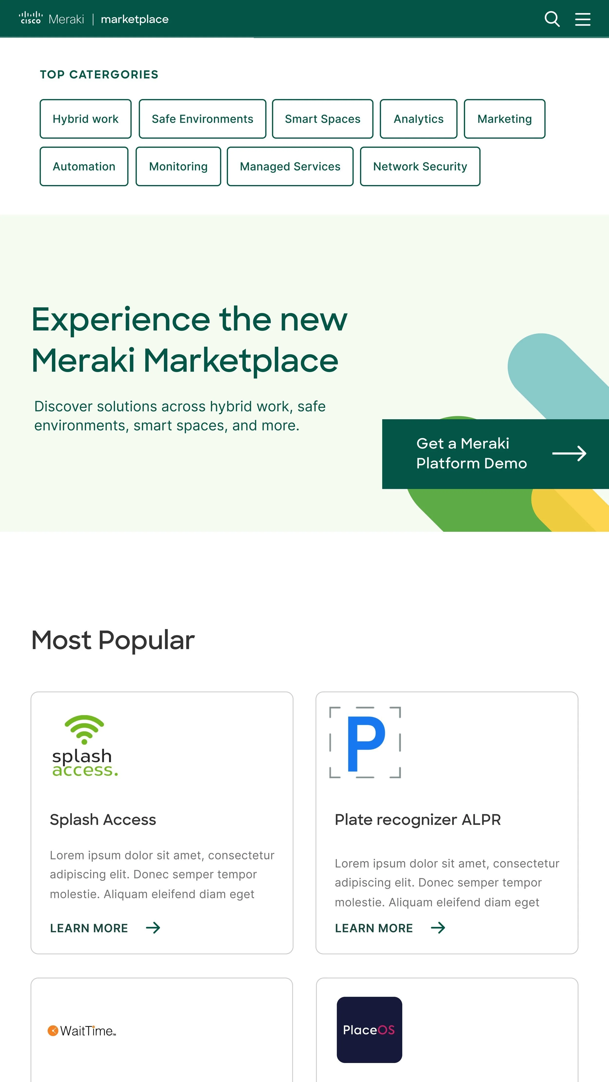
Solution: Display apps and filters upon arrival
Showcasing apps and filters on the homepage allowed for a personalized journey. This increased discoverability and built trust with our audience right away.
Problem: Category names confused the customer
App categories were geared toward industry professionals. The two primary categories ‘Business Outcome Solutions ‘and ‘Advanced IT Solutions’ were not easy to understand and yet were the starting point for the marketplace journey.

Solution: Rewriting app categories with all users in mind
Together with stakeholders, each category name was questioned, rewritten, and tested to ensure the new names were simple and easy to comprehend.
Hybrid work 〰️ Next generation campus 〰️ Flex office 〰️ Hot-desking 〰️ Contact tracing 〰️ Contactless engagement 〰️ Safety compliance 〰️ Security monitoring 〰️ Safe Occupancy 〰️ Threat detection 〰️ Asset tracking 〰️ Building management systems 〰️ Electronic shelf labeling 〰️ Digital signage 〰️ IoT 〰️ Sensors 〰️ Wayfinding & mapping 〰️ Wireless Private Network (WPN) 〰️ Access control 〰️ Loss prevention 〰️ Computer vision 〰️ Automated license plate reader (ALPR) 〰️ Crowd Intelligence 〰️ Footfall analytics 〰️ Customer experience 〰️ Guest WiFi 〰️ Online to offline marketing 〰️ Point of Sale 〰️ Proximity marketing 〰️ Real time engagement 〰️
〰️
Hybrid work 〰️ Next generation campus 〰️ Flex office 〰️ Hot-desking 〰️ Contact tracing 〰️ Contactless engagement 〰️ Safety compliance 〰️ Security monitoring 〰️ Safe Occupancy 〰️ Threat detection 〰️ Asset tracking 〰️ Building management systems 〰️ Electronic shelf labeling 〰️ Digital signage 〰️ IoT 〰️ Sensors 〰️ Wayfinding & mapping 〰️ Wireless Private Network (WPN) 〰️ Access control 〰️ Loss prevention 〰️ Computer vision 〰️ Automated license plate reader (ALPR) 〰️ Crowd Intelligence 〰️ Footfall analytics 〰️ Customer experience 〰️ Guest WiFi 〰️ Online to offline marketing 〰️ Point of Sale 〰️ Proximity marketing 〰️ Real time engagement 〰️ 〰️
Problem: Demo request form drop-off rates were high
We learned from partners that customers would reach out to them directly for a demo, as ticking so many boxes was off-putting.

Solution: Clear communication of the next steps
The UX copy and form design needed to be simplified so users would know that a partner would reach out after clicking ‘submit’.

Problem: Partner application drop-off rates were high
There were too many steps and legal content that deterred users from completing applications.
Solution: Breaking up the application into steps
This would allow us to track engagement and drop-off rates, and learn from our user’s behaviors.

Problem: Site navigation brought confusion
New users were confused with the actions behind the site navigation links. It took two clicks for partners to login and we wanted to simplify this.

Solution – Reduce the number of clicks
It made sense to be prescriptive in the titles to users knew where the links would take them. We also wanted to implement a site search so users could do a site-wide search while on any page.

“Browse Apps” versus “Browse” tested as clearer to our audiences

Typeahead suggested apps to users as they wrote
Competitor audit
Our UI designer tackled the research portion of this project, investigating what a best-in-class marketplace looked like.


Inspiration
There were some great filtering and sorting options that we wished to experiment with in our layout. Looking outside of tech companies inspired some solutions.
Explorations
Our research fueled ideas around filtering, search, app detail tiles, and hero exploration. Many iterations of the primary category tabs were tested as well as and/or filter options.
Visual treatment of primary categories, app tiles and a tagged filtering system

Search bar in navigation, apps displayed in new subcategory layout

Renaming filter categories, enhanced hero and filtering, new app tile design

Further iterations of the naming convention, new hero and filtering treatment
Hero iterations
We partnered with the brand team to land on a hero design that satisfied our stakeholders and worked well across breakpoints.


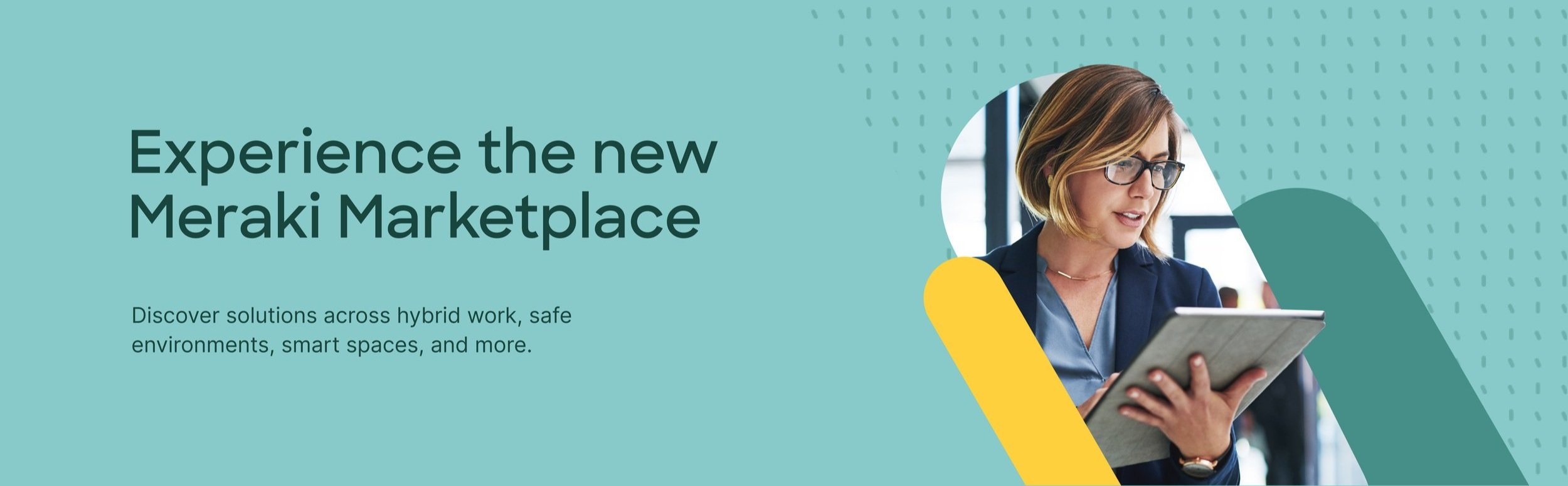
We wanted to push some ideas around quick links in the hero, which also went through iterations.

Mobile


Tablet


Desktop
Technical limitations
Due to timezone constraints, we were unable to engage with our remote development team over calls. We were assigned an agency project manager who acted as the liaison between our feedback and their work.
Learnings
We shared a Slack channel with our agency but in the future, I would request a shared slack channel with the remote development team. This would cultivate better communication, collaboration and more rapid iterations.
Since going live Nov 2021
〰️
Since going live Nov 2021 〰️
Today, the Meraki Marketplace is said to be the industry’s most expansive marketplace with
250+ total applications → up 40% YoY
100+ ecosystem tech partners → up 50% YoY
50+ solution categories
Solves for 1,000+ use cases
100+ published customer success stories
👉🏻 Cisco Blog – Take a New Look at Meraki Marketplace (Nov 5 2021)
Homepage
60% decrease in drop-offs within the first month
20% increase in visitors a month since going live (considering circulation from meraki.cisco.com)
App category titles
The number of clicks across app category filters increased by over 35% YoY
This translates to a more navigable system since users are more comfortable exploring
Redesigned forms
Ecosystem partner registration – Drop-off rates have decreased by over 30% YoY