Legal & General digital pension
Project overview
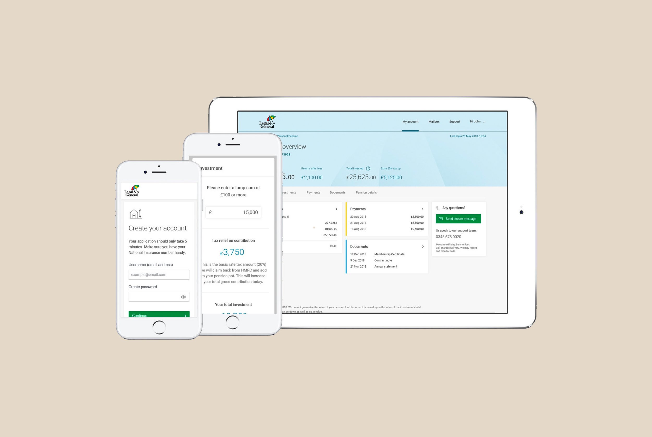
Designing a new Personal Pension product for Legal & General involved pre-sales landing pages, a simple checkout journey, and an account management platform.
I was the Lead UX Designer on this project and worked closely with a Lead UI Designer, Copywriter, and development team to push and validate the front end and bring the designs live.
Design process
This can be broken down into three phases. Each involved different forms of research, analysis, and production while aligning with the business propositions.

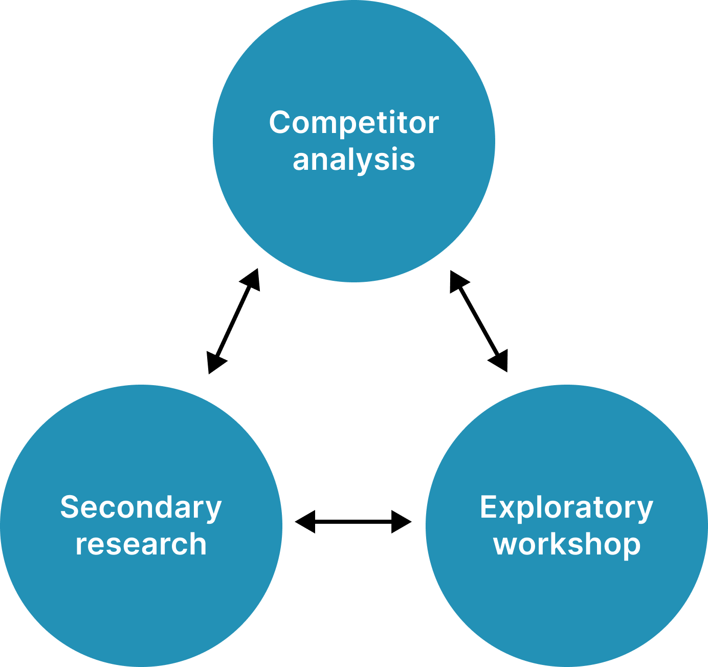


Competitor analysis
As a team, we analyzed competitors’ product offerings, end-to-end user journeys, messaging, and visuals to highlight differentiators

Secondary research
Building on existing UX materials like user flows and experience maps, we were able to accelerate our journey mapping and technical requirement sessions.


Exploratory workshop
Since the company was at a point of digital transition we held a discovery phase where we defined what an ‘engaging experience’ was. Our takeaways helped guide our visual transformation at the company.

Persona workshop
‘Anya’ was identified as our core user type. An ambitious young professional working in the ‘gig’ economy. Our business proposition was to target users who were no longer contributing to a workplace pension but are still looking to save and benefit from a tax-free savings account.

UX copy
Copy must be simple, intuitive, and helpful, it’s at the core of the good design. We consistently iterated our messaging as feedback from user testing came in.
We worked closely with the brand and compliance team to define key messages, USPs, and a language that resonated with our core target audience (Anya) across all screens.

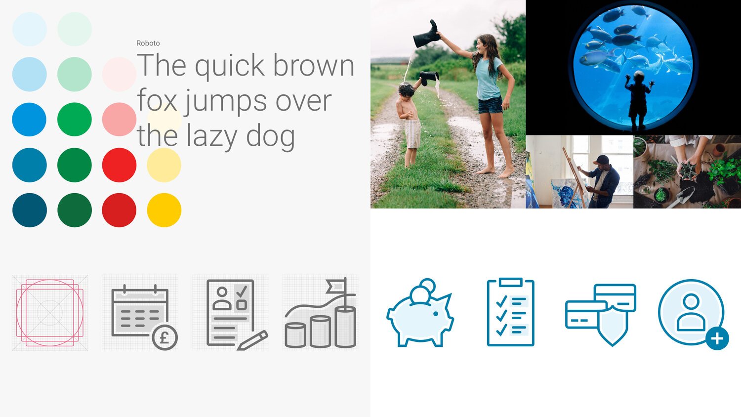
Design principles
Our visuals are the first thing users see that defines our brand. We worked closely with the brand team to define our imagery and iconography.
Iterations of designs were pushed as user testing results came in.
Wireframes
The wireframes kept us honest during the development of the product, working in tow with engineers and architects to ensure our designs were feasible technically.
We worked closely with the design team based in Hove (south England) to evolve the Design Language System (DLS) and develop new and existing CMS components as needed for screens.


Prototype
You can view the clickable InVision prototype here.


Quantitative testing
I conducted a variety of online tests to challenge and validate designs and messaging. This helped us to steer decisions and iterate rapidly, often with same-day results.
You can view the remote user test results report here.

Iterations
These rounds of testing helped to improve the designs and usability of the checkout journey before it went live. Further iterations were made as we monitored the performance of visitors and drop-off rates.


We were also able to apply feedback from the ‘Select your fund’ tool analysis in the tests to the existing ISA product which helped with visual improvements, performance, and usability.
